— Team
✦ Mahmoud Galal
✦ Ayla Kekhia
✦ Celia Boureau
Duration/ 10 Days, 60 Hours
Product/ Website
Bootcamp/ Ironhack
Client/ Ghiott Confectionery
— Challenge
The brief of the class as a part of Ironhack UX/UI Bootcamp was to design a responsive website for a local business or professional in which we create an e-commerce website as it is often the best way to promote the shop, as search engines do support local businesses. It is also a great way to increase sales and revenue by offering services such as delivery or click-and-collect.

The story of Ghiott is the story of the Salaorni family. From fine Tuscan pastry and Ghiottini, to Ghiott Firenze chocolate, our story begins in 1953 and speaks of inventiveness, courage, tradition, quality and love for good things.
Nowadays, Ghiott is a family-run factory at the third generation, lead by its founder’s daughters and grand-daughters. Ghiott specialises in a wide range of products that are all characterized by a strong relationship to the Tuscan territory, and which reach the shelves of both Italian and International clients.
— Problem
Ghiott is an artisanal product of high quality and very high standards for mature people who appreciate this kind of specialty products with a large array of biscuit variety but due to the Covid-19 era and the economic situation going on worldwide they are facing some struggles with the sales because their only points of selling are the supermarkets as they don’t have an e-commerce platform.
— Client Discovery
To deeply know about the client and the roots of the problem and get details from the people behind this precious brand, we first conducted a stakeholder interview with the one and only Ghiott CEO, Laura Salaorni.
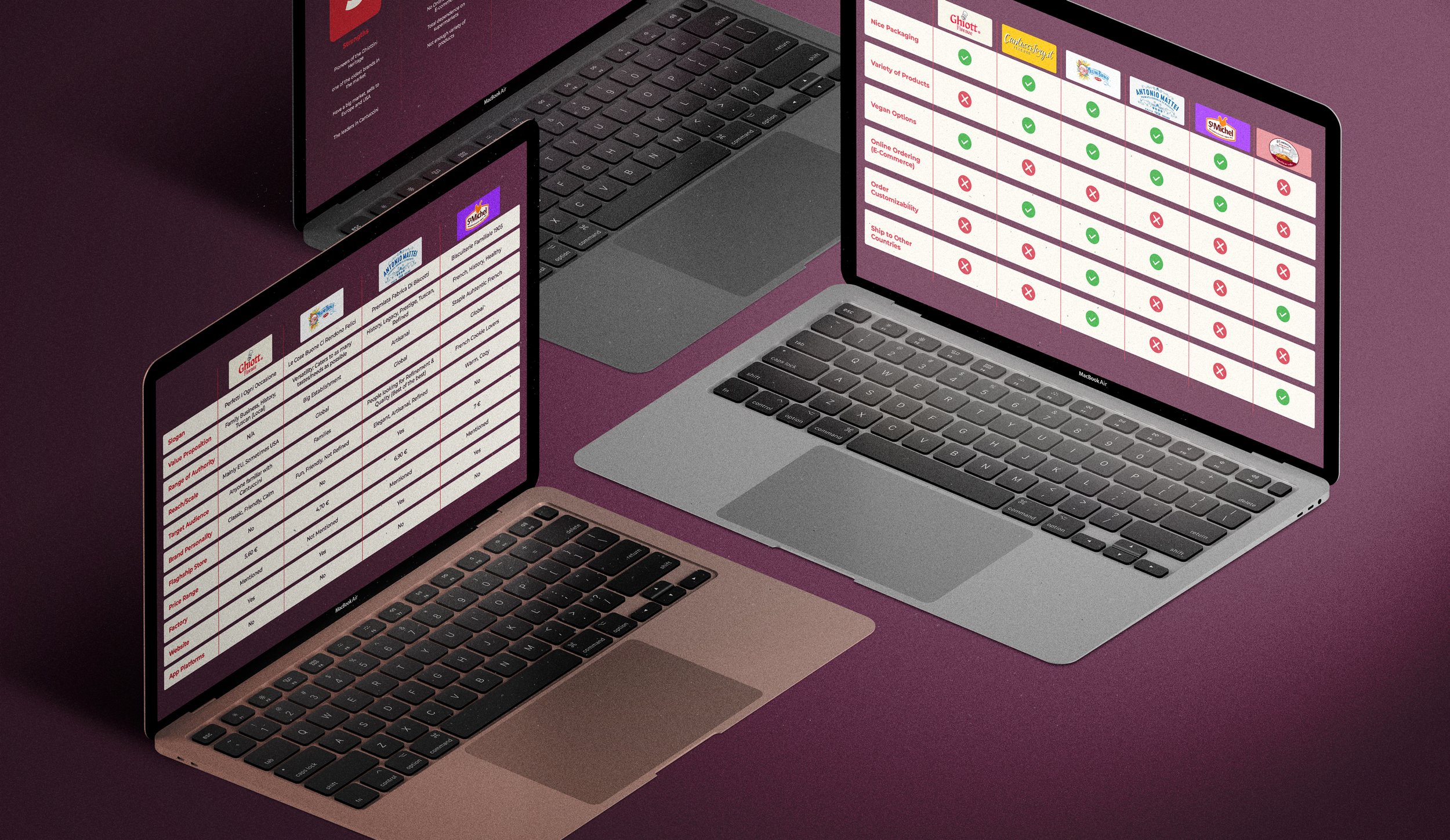
Then we decided to take a deep dive into the brand and their competitors and the whole business by creating a brand comparison and feature comparison map.

— Research
To get accurate insights from our users and to be in their shoes so start the empathizing stage we conducted 5 interviews with people from the age of 35 and above.
One of the most important aspects about this target audience is that they are not that tech savvy like our generation so the website had to be super clear, super direct so it can be easy to navigate and get the products as smooth as possible.
So, we grouped our data and findings from the interviews via the affinity tool diagram.
Then after synthesizing our data we managed to find these patterns that are causing the main problem.
“One day I went to my local supermarket and i just couldn’t find it there anymore. I asked if they didn’t sell them anymore and I didn’t really get an answer.”
User Quote:
— Key Pain Points
“My husband only eats ghiottini’s, so I had to go to another shop to find them.”
“It’s just annoying sometimes because you can’t find anything cool in the groceries stores in Fano.”
“Here in NYC, it’s hard to find any of my favorite things from Italy, even in speciality Italian stores.”
— Key Insights
Accessibility/ Users can’t find the products in all supermarkets.
Supermarket unreliability/ If the product was once there, it can suddenly become unavailable.
Wasted time and Energy/ Due to having to go to another store just to find Ghiottini’s
Almost impossible to find outside EU/ Users can’t find their favorite products abroad.
— Anna’s Dilemma
Now, after getting a picture of some problems now it was time to dive deep along the process to find our main pain points so we created our user persona.
— Anna’s Journey
To showcase Anna’s painful journey to find her favorite Ghiott Product we proceeded to illustrate her customer journey map.
— Problem Statement
So now that we have got the full picture it was time to define our problem.
Adults who consume Ghiottini’s need to find a way to easily buy them from designated sources because they sometimes can’t find them at their habitual supermarkets and have to go to another store to get them.
— So, How might we
Make Ghiottini’s more easily accessible to people who buy it?
— Ideation
We had few concepts sketches and found out some solutions to implement to tackle our problem which were narrowed down to creating a website with an e-commerce platform and to make it even more engaging we created a subscription package where you could have weekly or monthly Ghiott package delivered to your home regularly without the hassle of ordering every time and also supporting our users with a real map guide for our physical selling points.
Then we used MOSCOW Prioritization Method to categorize our solutions in relation to their priority.
The updated Ghiott website will offer users an e-shop enabling them to purchase Ghiottini’s online, a subscription option enabling them to automatically receive door-to-door Ghiottini’s on a weekly or monthly basis, and an up-to-date selling point guide enabling them to know exactly where they can physically buy Ghiottini’s anywhere in the world.
MVP (Minimum Viable Product):
— Information Architecture
We then started working on our information architecture by starting with the sitemap and then the userflow.
— Sitemap
— Wireframing
We first created our low-fidelity wireframe with the consideration of making the website as clear and straight-forward as possible for our target that conveys our userflow.

Then we jumped into our mid-fidelity wireframe which became really closer to our vision.
— Competition
After running some usability testing to get feedback on the prototype from our users and they actually raised one common issue which was related to the naming of the subscription package we had all the feedback from the mid-fidelity in consideration. Now it was time to work on the visual part, we first conducted a visual competitive analysis on three of our main competitors: Antonio Mattei, Pavesi & Leonardo to get a clear vision on the visual aspect.
Heritage
Expertise
Sophisticated
And then we finally came up with our new moodboard and brand attributes for Ghiott.
— Moodboard
— Style Tile
Now that we have a clear vision and picture of our new Ghiot identity it was time to make a style tile for our brand with some uplifting to the logo to make it more modern and fresh for the digital era.
— The Website
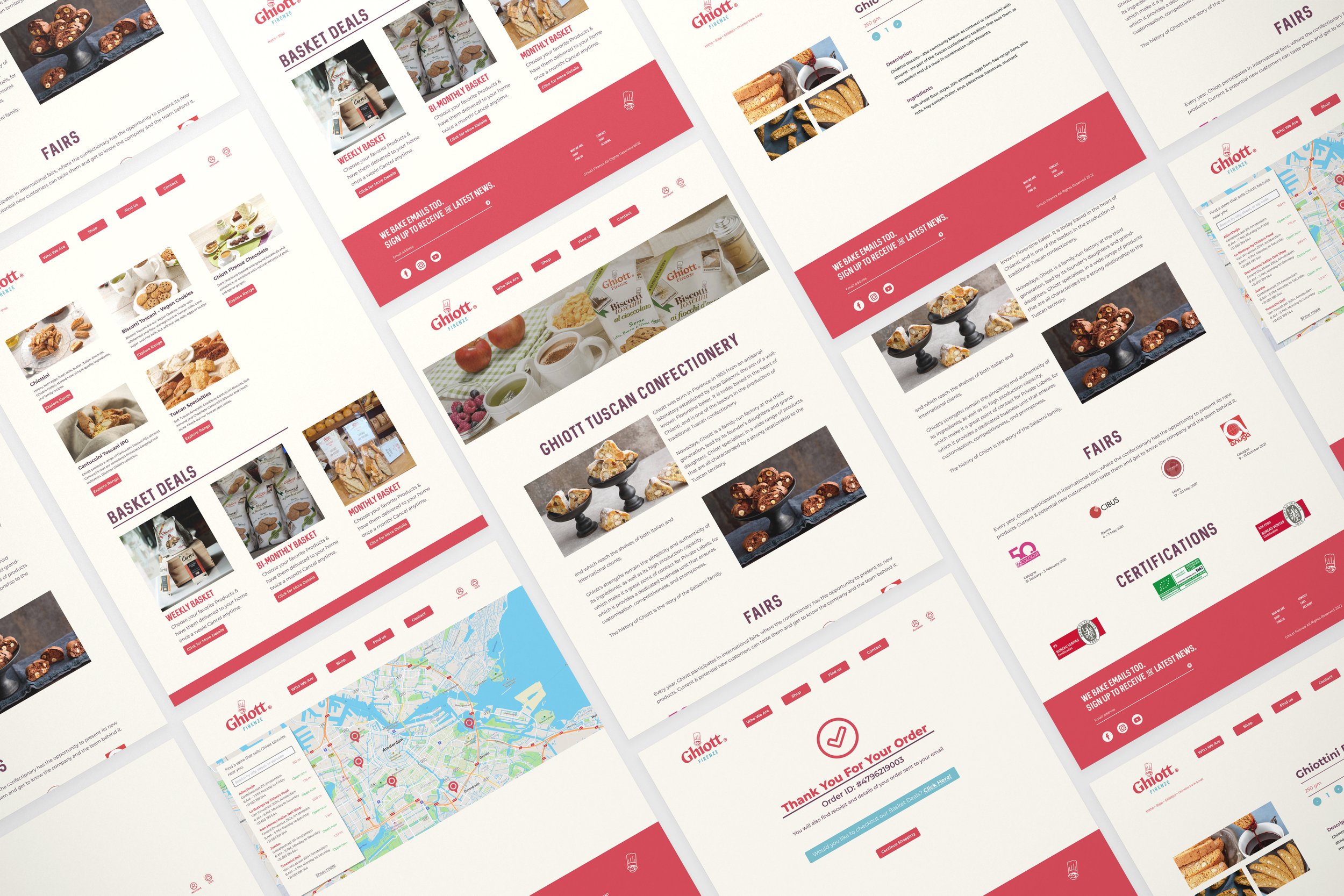
Finally, it was time to design our actual website with the e-commerce platform & other features integrated with consideration that it needs to be easy and clear as well as the new branding, colors & typography are consistent across all the pages.

— Key Features
E-commerce platform/ Find all the Ghiott products you love on the website and get your favorite products delivered to your home with one click.
Real map guide for our physical selling points/ Prefer the classic way? or may be would love to get your Ghiott when you’re doing your grocery? Now you can find all physical sellings points with a real interactive map.
Subscription Package/ Tired of ordering your favorite products all the time? Customize your subscription package to get your favorite order delivered regularly to your home and never run out of Ghiott biscotti again.
— Responsive Design
Mobile-first approach is always the go but on this project we had a little challenge we managed to achieve. reverse-engineering the approach by conducting the rest of devices the other way around.

— Learnings
User Centered Design/ This was a real challenging and decent practice on the user centered design because the fact that it is a totally different target to our thinking and I could see my self literally putting my self in the user shoes and mind while working on this project in every step.
Team Collaboration/ Working with this lovely team with different cultures was fun and a nice practice on collaborating with a lovely team and bond together in a nice creative fluid way to create this project.
Testing/Iteration is key/ Testing this product along the various fidelity stages gave us really valuable feedback that helped us significantly to develop our project and iterating the whole process made this project more mature.


