— Team
✦ Mahmoud Galal
✦ Ayla Kekhia
Duration/ 10 Days, 65 Hours
Product/ IOS App
Bootcamp/ Ironhack
Client/ Daily Health Conference
— Challenge
The brief of the class as a part of Ironhack UX/UI Bootcamp was to create a wellness app of our choice for a non-profit organization called The Daily Health Conference as a part of their portfolio of wellness apps. They are aware that the competition is fierce across the Health Tech space. So this year, The Daily Health Conference wants to unveil a series of digital wellness apps at their annual flagship conference in San Francisco.

The Daily Health Conference is very excited to explore how technology can be used to help people live healthier lives.
While brainstorming what the new mobile apps should do, the board realized that the opportunities for translating the concept of wellness into a digital product are virtually infinite. Their members could use their apps to keep track of diet plans, fitness programs, mental wellness, stress levels, water intake and so on. The posibilities are endless and they are not exactly sure where to begin!

— Problem
We decided to go for an unheard topic, a topic that is still to this day a taboo for men to talk about. to talk about their sexual insecurities, feelings or their sexual well-being, so it was time to break that taboo and create our app helping men talk about all their problems with experts and have a safe space to share experiences together.
— Market Discovery
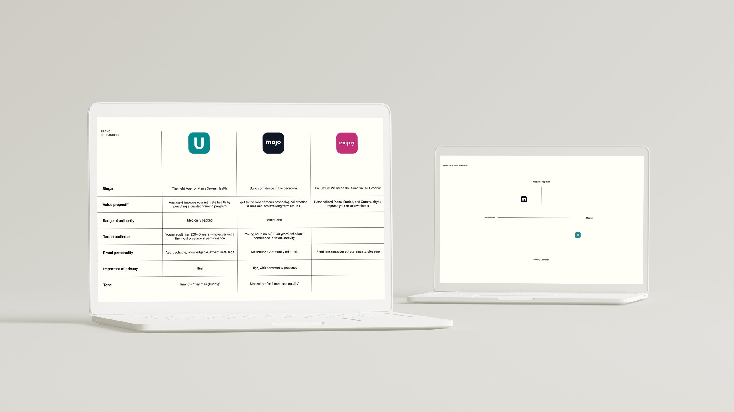
The market is already filled with a lot of women sexual wellness apps but very few for men and that’s where we started, by first working on our brand comparison, feature comparison & market positioning map.

— User Discovery
We first started with collective quantitative data for the project to start the emphasizing phase by conducting a survey that’s consisting of 10 questions where we would find some interesting insights that would help us in working on the interview questions.

70% Of them felt rather uncomfortable at the prospect of downloading a men’s sexual wellness app. The Same Percentage Said that the it would constitute a safer space to managing this topic than the real world when given an assurance of privacy.
Survey Responses:
— Survery Findings
Of male users reported never resorting to wellness apps. The same percentage also said they have experienced some degree of sexual performance anxiety in their lives.
60%
Half of the interviewees reported never practicing activities targeted to the improvement of their sexual wellbeing.
50%
Of the interviewees do not feel comfortable discussing their sexual insecurities with their closest friends or partners.
80%
Of them felt rather uncomfortable at the prospect of downloading a men’s sexual wellness app. The same percentage said that the it would constitute a safer space to managing this topic than the real world when given an assurance of privacy.
70%

— User Interviews
We found a lot of interesting insights which led us to put in consideration that this product should have the luxury of being anonymous to ensure a safe space for all men. We then conducted our interviews with 5 men from the age of 20 to 40 to validate our assumptions.

— Problem Discovery
After synthesizing our data through affinity diagram data we came up with some key findings that would align with our survey results most men would not talk about their sexual insecurities with anyone even their closest friends.

“There’s a lot of taboo and stigma that you’re a weak man to talk about this stuff. It is about time to talk about this topic. We all have feelings, it would be nice to actually demolish that once and for all.”
User Quote:

— Apprehensive Adam
We then carried on the discovery of the problem process with the user persona.

Moving on with the process of finding the exact pain points and problems we proceeded with Adam’s Journey Map.
— Problem Statement
At this moment we could finally define our problem.

Men need to find a way to explore & improve their sexual wellness in a shame-free environment because they are faced with a stigma associating sexual insecurity with a lack of masculinity.

— So, How might we
Provide a safe space for men to share his concern in a way that makes them feel less isolated?

To this day, it is still a taboo for men to talk about their sexual insecurities, feelings or their sexual well-being

— Ideation
Then it was time to work on our ideation and start the brainstorming.
We had few concepts sketches and concept testing to narrow it down and find out the best solutions to implement to tackle our problem.
Then we used MOSCOW method to categorize our ideas by priority.
The proposed app will allow men to explore and improve their sexual and reproductive health in a shame-free environment by providing them with clinically-backed tools and resources, curated exercises by experts to target-treat areas of concern, and a community for men to share their experiences anonymously.
MVP (Minimum Viable Product):

— Information Architecture
We then started working on our information architecture by creating our userflow.
— User flow
— Wireframing
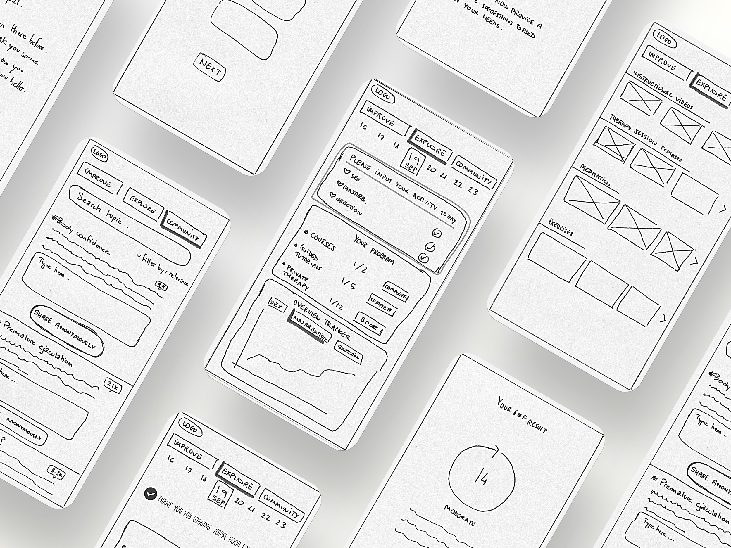
We started with low-fidelity wireframes and started testing it with users to collect insightful feedback.


We carried on the feedback from the low-fidelity and then jumped into the mid-fidelity with implementing all that feedback along with making the app as clear as possible.
— Feedback
We then did some usability testing to validate our wireframe and find the issues that need to be addressed and amended and actually our users pointed out a few things that are important.

like the fact that there’s no question tracker for the onboarding process which can make it frustrating for users.
“I want to know how many questions there are in total in the onboarding”.
Rearranging the questions to make them less intense.
“Re-order the onboarding questions by intensity.”
Making the graphs more accurate and resonate with the quality in relationship to quantity.
“I want the progress graph to tell me how my current sexual behavior is affecting the overall quality of my sex life.”

— Competition
We the jumped into the visual part, to start on the right track, we first started with the visual competitive analysis.
Then we came up with our moodboard to reflect our new brand and attributes.
— Moodboard

— The Naming
Inspired by our process during the mooboard along the way, the name of the product came up, which has come to be Eros.

Why Eros? Eros is a greek word that means The Greek god of erotic love, lust and sex which is symbolically relevant to our persona.
— Style Tile
Then we started working on our style tile.

— Style Guide
After some exploration and playing around and finalizing the brand, we then came up with a basic style guide.

— The App
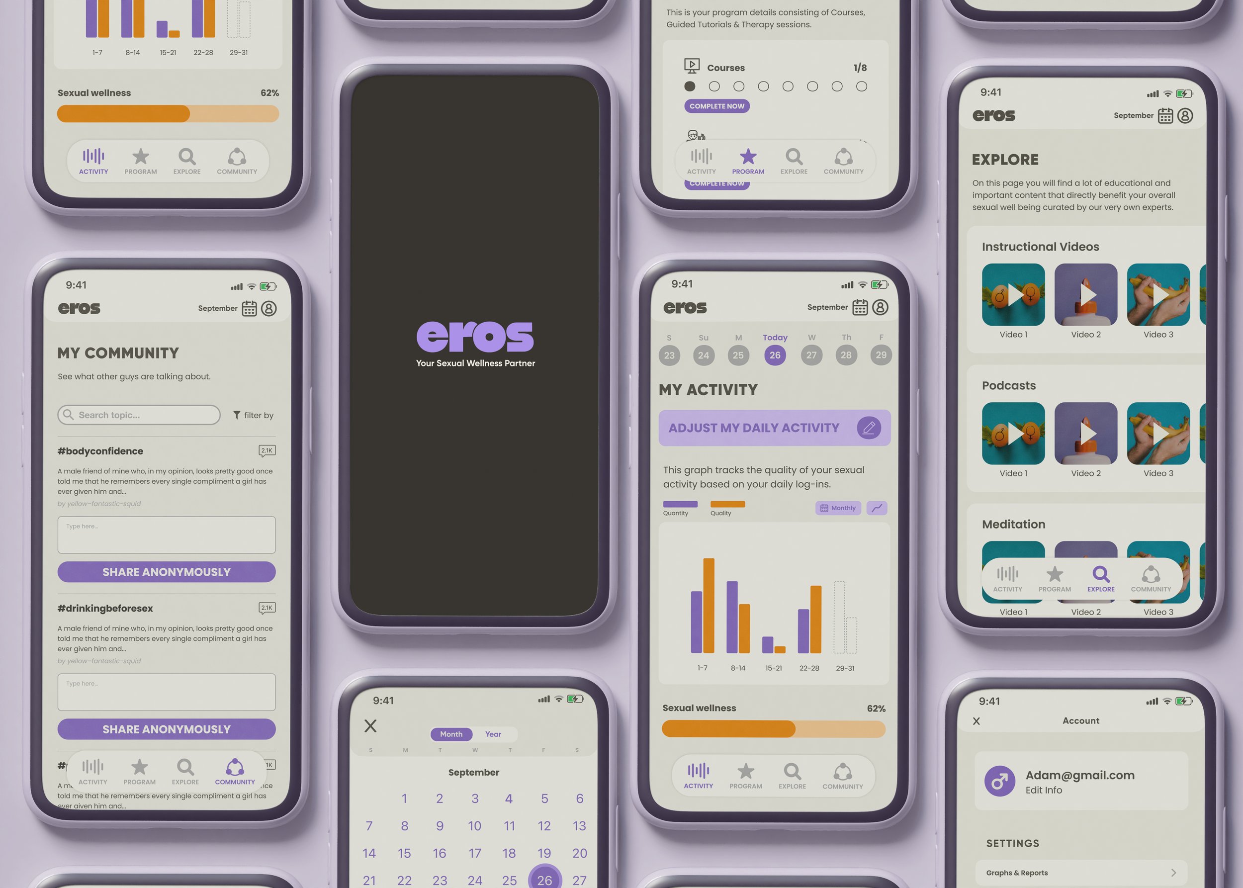
Finally it was time to implement the actual product, using our style guide & inspirations and also using the atomic design methodology in creating our components. We proceeded with creating our actual design which is relevant to our product and makes the user journey through the app reassuring and giving the user a totally safe space in his phone.

— Key Features
On boarding/ User can go through the on boarding process and answer all questions to be examined by experts so they can create curated programs and medical diagnosis just for this case to improve his sexual wellness.
My Program/ User can check out the custom-made program by medical experts for his specific case where he would be supported by a tailored video made for him by his assigned expert and go through all the courses and tutorials to treat his area of focus and to improve his sexual wellness.
Activity/ User can log in his activity for the day so he can be provided with analytical data regarding his sexual behavior and wellness as well as a calendar where he can see all his activity for each day across a month or a year. The user also have the option to erase his data permanently whenever he decides to.
Community/ User can access the community where it is basically the safe space for men to share stories together and find topics by real users nested in topics where they can see all other men problems and they can check the comments to relate to and a medical expert can answer their concerns too. The user can browse, post or comment anonymously.
Explore/ User can check out explore page where it provides him with general knowledge and important legit articles related to exercises, dietary, meditation etc.. that can improve his overall sexual wellness and properly educate him on that topic.

— Learnings
The Wellness Sector/ It was fun and challenging to work on a wellness sector which is a different field to try working on with a lot of restrictions and obstacles we have to take in consideration and try to solve.
The Time Restriction/ Working on this in a time frame of 10 days was challenging yet fruitful, we managed to work with atomic methodology when we created our components and we managed to work on empty states and other different states to make it an inclusive experience which was an achievement.
Prioritizing our Features/ It is truly important to prioritize the features you can have in a product, you can’t have everything. especially at launch, from a business side and from a user perspective as well to avoid overwhelming them with a lot of features that can have bad consequences & impact.


