— Team
✦ Mahmoud Galal
✦ Ayla Kekhia
✦ Celia Boureau
✦ With the collaboration of the lovely mentors from Impala Studios/ Thiago Santos & Aline Lickel.
*This project has been selected as the best project in the bootcamp and has been nominated to Ironhack's Hackshow conference.

— Challenge
The brief of the class as a part of Ironhack UX/UI Bootcamp was to collaborate with an External client to solve a design problem they have.
We collaborated with Impala Studios to help evolve their Alarm Clock HD app from just an alarm clock to be in the sector of the sleep wellness apps to enable the users to track their overall sleep quality and have a better health.

Alarm Clock HD is an app by Impala Studios where you can set multiple alarms to wake up your way. Check the weather or fall asleep to your favorite iTunes music with our full-featured Alarm Clock.
Alarm Clock is widely used by millions all over the world as an alternative alarm app which has a landscape digital clock UI feature so you can turn your smartphone into a physical digital clock in a second! it also provides the users with infinite customization where they can personalize the clock display with unlimited colors and control the brightness. Set any number of alarms, how they fade in and what you wake up to. Light up the dark at night by shaking your device to unlock the built-in flashlight.

— Goal
To evolve from the “Alarm Clock” category and be positioned into the wellness sector. To become the best sleeping companion available. Sleep tracking, sleep sounds, great variety of sounds and multiple alarm clock visuals for all ages and groups. Alarm clock HD helps people to track and understand their sleep, improves their sleep quality and to wake up refreshed to improve their day.
— Market Discovery
In order to get an overview and know about all the details and have a deep understanding of the market we did some secondary research and looked at our main competitors from the current market position and the future market position. We then conducted a brand comparison, feature comparison & market positioning map.

— Market Findings
Almost all of the sleep tracking apps: Apple Watch integration & compulsory account creation.
The majority of competitors provide alarm features but none of them propose an digital clock the way Alarm Clock does.
All of the sleep tracking apps also provide sleep aids (stories, meditation, white noise…)

— Customer Discovery
We started with collecting quantitative data from the users to start the Emphasizing Phase by conducting a survey that’s consisting of 12 questions where we would find some interesting insights that would help us in working on the user interview questions.

Survey Responses:
80% of users said that stress and anxiety prevented them for falling asleep.

— User Interviews
We had a lot of assumptions and insights from the surveys but to validate everything and think as the user we then conducted our interviews with 5 users from the age of 25 to 44.

— Research Findings
Then we synthesized our data and grouped them together to find patterns using the affinity diagram tool then we managed to find these patterns that are causing the main frustrations for users.
PRE-SLEEP
The biggest cause of insomnia and uneasy sleep are poor pre-sleep habits or anxiety.
Users found that sleep tracking without any tools was useless.
POST-SLEEP
The biggest wake-up challenge related to over-snoozing.
Users over-snooze because they’re half-asleep and can’t tell the difference between the consecutive alarms.
In these two phases, the awareness of the user is very low.

User Quote:
“When I’m woken up I’m not thinking. And the snooze always sounds the same so I don’t have any indicator what time it is. That’s why I manually put two alarms so I can control my snoozes.”

— Sleepy Sebastian
To dig deeper to the problem along the process we proceeded with creating our user persona.

Moving along with the frustrating journey of Sebastian we illustrated his journey map.

— Problem Statement
So now that we have got the full picture it was time to define our problem.

Adults with sleeping difficulties need to find a way to sleep faster and better, and wake up rested and on time because they have poor night time habits.

— So, How might we
Provide a solution for people with sleeping difficulties that would improve the quality of their sleep and wake up on time and rested?

— Ideation
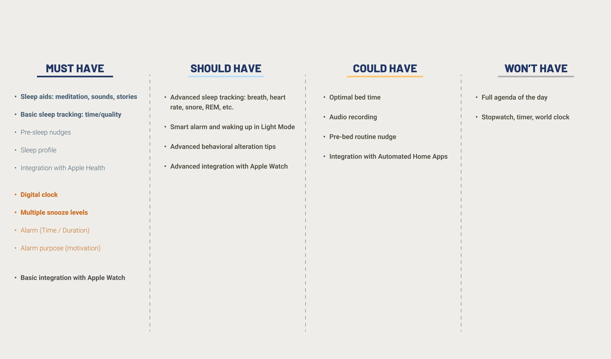
We had few concepts sketches and narrowed them down to the best solutions to implement to have all the essential features while keeping the transition smooth for our users. some of them were to integrate Sleep aids like meditation, sounds, stories. Basic sleep tracking, Pre-sleep nudges, Integration with Apple Health while keeping the unique digital clock and adding multiple snooze levels & basic integration with Apple Watch.
Then we used the MOSCOW Prioritization Method to categorize our solutions in relation to their priority and to start having a strategy for the launch time for the features to ensure the smooth transition to the new sector.

MVP (Minimum Viable Product):
The re-imagined Alarm Clock HD will propose features pertaining to two stages: sleeping and waking up.
It will help the user develop healthier pre-sleep habits and provide him with the aiding and tracking tools for a faster and better sleep. For the alarm, it will provide gradual snooze levels as well as an incentive to wake up on time.

— Information Architecture
Then we dived into creating our sitemap & userflow to work on our information architecture.

— Sitemap

— User flow
— Wireframing
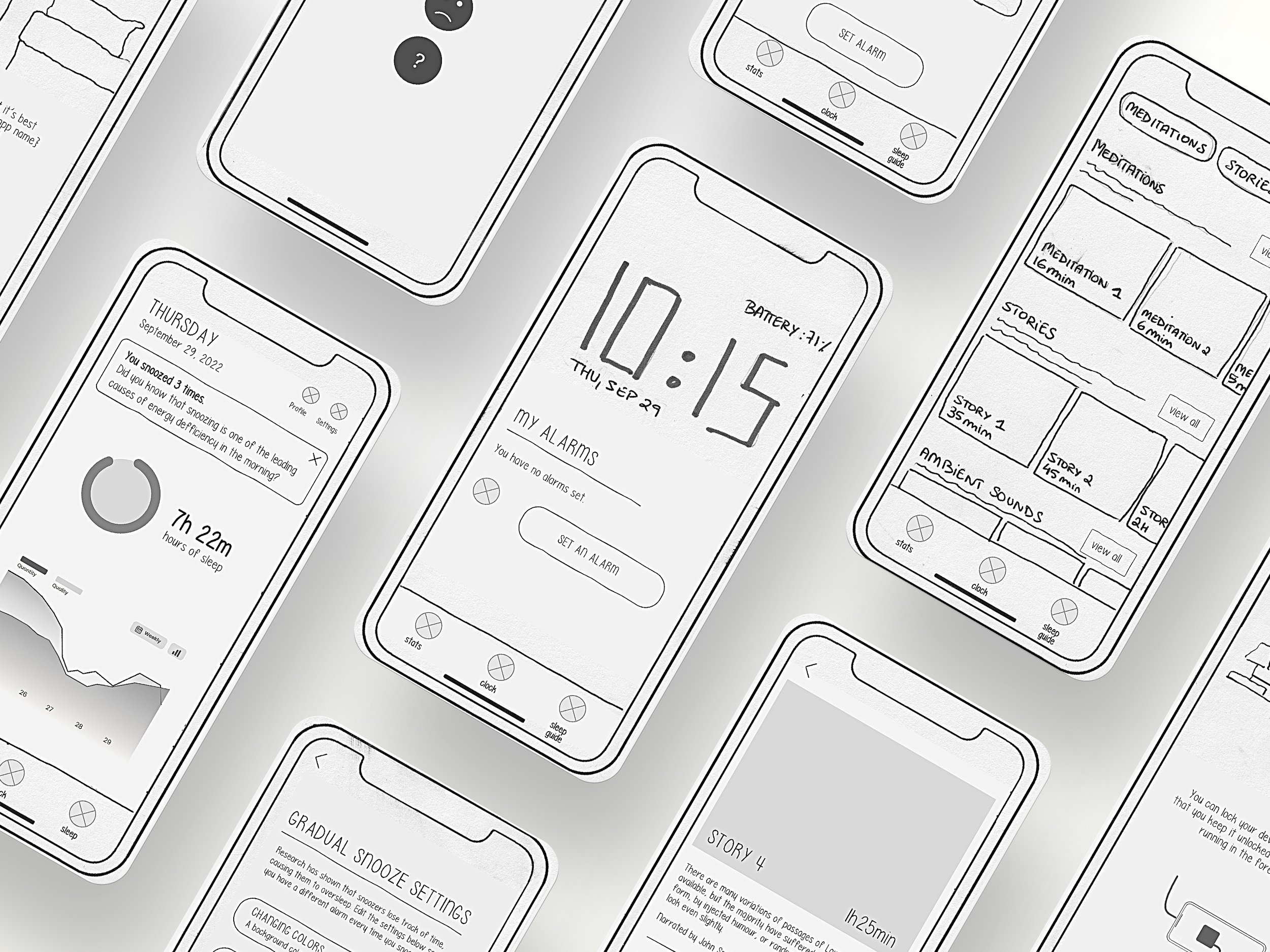
We started with low-fidelity wireframes and started testing it with users to collect insightful feedback.


We had a lot of insightful feedback which we carried on to the mid-fidelity stage and started implementing all this feedback during that process.
We then did some usability testing to get feedback on the prototype from our users and they actually raised some insightful issues with our prototype which we have taken into consideration and had them in mind while working on our final product.

— Competition
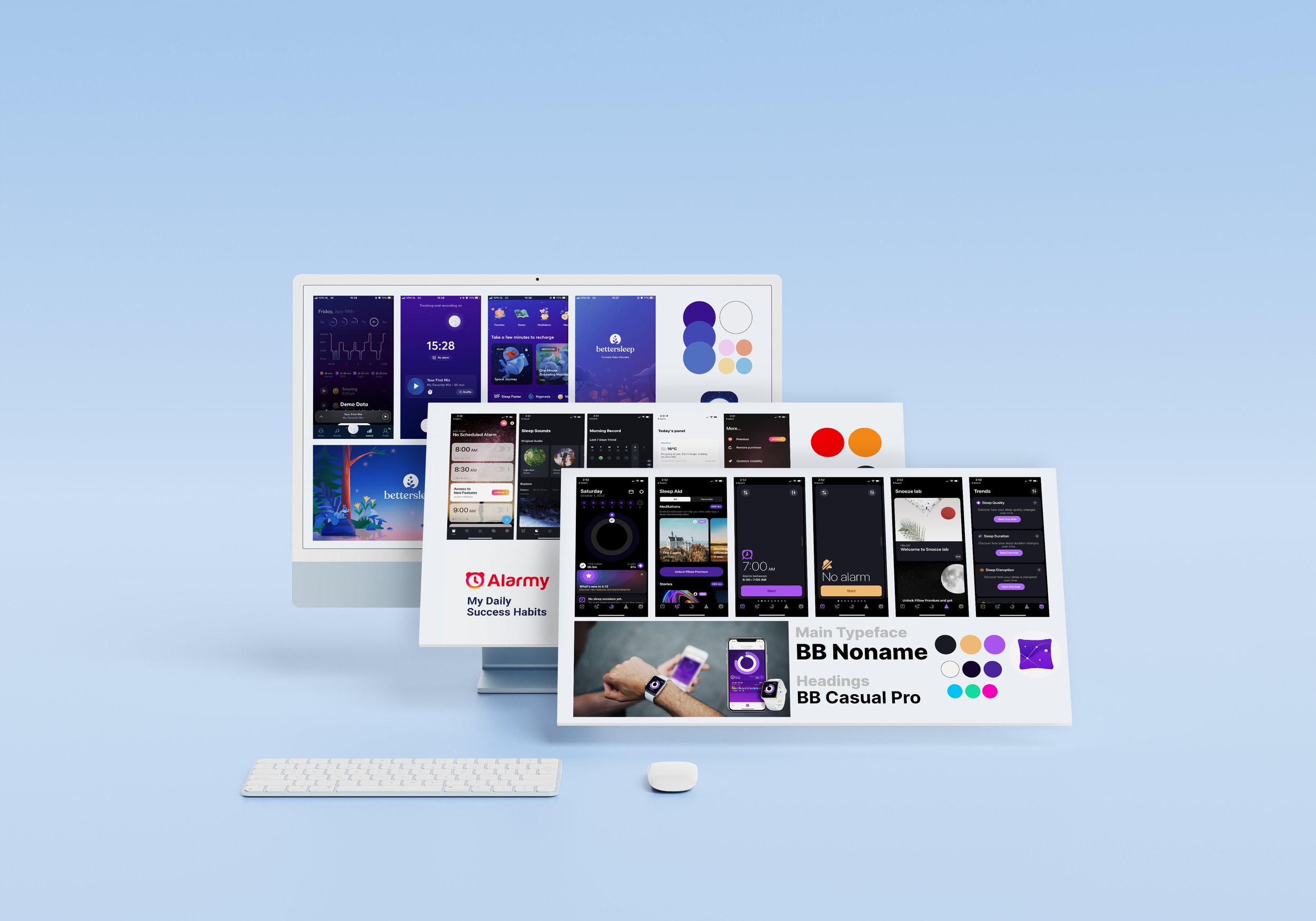
Now, it was time to work on the visual part, we first conducted a visual competitive analysis to get a clear vision on the visual aspect, especially that there are a lot of sleep wellness apps in the market, so we chose 3 main apps for the visual analysis which are Alarmy, Better Sleep & Pillow.


— Strategy
Before heading into our new brand attributes and moodboard we crafted a strategy for the launch of the new features from a visual aspect as well so we decided that In order not to overwhelm the 520,000 users currently using Alarm Clock, it made sense to us to proceed with a slow transition from two aspects: The naming & branding.
— Moodboard
And then we came up with our new moodboard and brand attributes for the re-imagined Alarm Clock.

— Style Guide
Now that we have a clear vision and picture of our re-imagined Alarm Clock identity it was time to make some explorations in our style tile for our brand uplifting then we worked on collecting and organizing our elements to work on a basic style guide.

— The App
At this moment we had an almost complete look of our new product with some high-fidelity pages and which direction it is going for, we then had a checkpoint from our lovely mentors from Impala Studios and we had a design critique from the whole team which provided us with a lot of helpful feedback and important points that needed to be addressed.
Finally, it was time to design our re-imagined version of the app that is heading towards the sleep wellness sector.

— Key Features
Pre-Sleep Nudges/ Users gets push notification to remind them of their sleeping time and they get redirected to the homepage where they receive tips about the new features added.
Adding an Alarm/ Users go to alarm page when adding an alarm, they can navigate between a specific time or duration. Choose their settings for gradual snooze features and finally add the alarm to the alarms card.
Choosing a Sleep Guide Aid/ Users can choose from a wide variety of sleep guide aids that can help them fall asleep easily whenever they struggle to and follow the steps to change the orientation of their phones to have it in landscape mode for the large digital clock UI.
Gradual Snooze/ Users have their landscape digital clock display on and wake up to the alarm with the gradual snooze feature & alarm purpose on the top and then snooze all the three snoozes until they finally get a final wake up call.
Sleep Profile/ Users add their mood upon waking up for the day and get to the sleep profile page where they can check the overall sleep wellness and graphs showing the mood and sleep quality all over the week/month. Users can also check their mood and sleep quality in the calendar and can also access the settings of their profile.

— Apple Watch UI
And finally we started working on our Apple Watch UI we had our basic screens at this stage.


— Next Steps
At this stage we like the feedback we got from our users but we have a big plan a head to craft our product to be the ultimate sleep wellness apps.
- More Usability Testing
- Exploring advanced behavioral tips
- Adding an on-boarding for new users
- Finishing the Apple Watch UI
- Working on the advanced features for sleep tracking
- Advanced Integration with Apple Watch

— Learnings
Smooth Transition/ When we first started this project we had a lot of ambition to have all features launched at once but when we thought about it and came up with a strategy we learned that it’s best to have the features launched in stages so that we don’t overwhelm our users especially that that the app is evolving from just an alarm clock app to a sleep wellness app.
Enough Time for Each Stage/ Working on a project by a real client made me appreciate that each stage in the Design Thinking Process needs enough time from the user research to testing and validating our assumptions and design solutions to ensure that it’s 100% user centered solution and is easy to use for them.
Design Critique Importance/ We had our first official design critique by the lovely team from Impala Studios which was really helpful and gave us a lot of positive feedback and insightful areas of improvement which helped our project become better and user centered.


